Realpage Inc.
Product - Website Plus Collection Theme
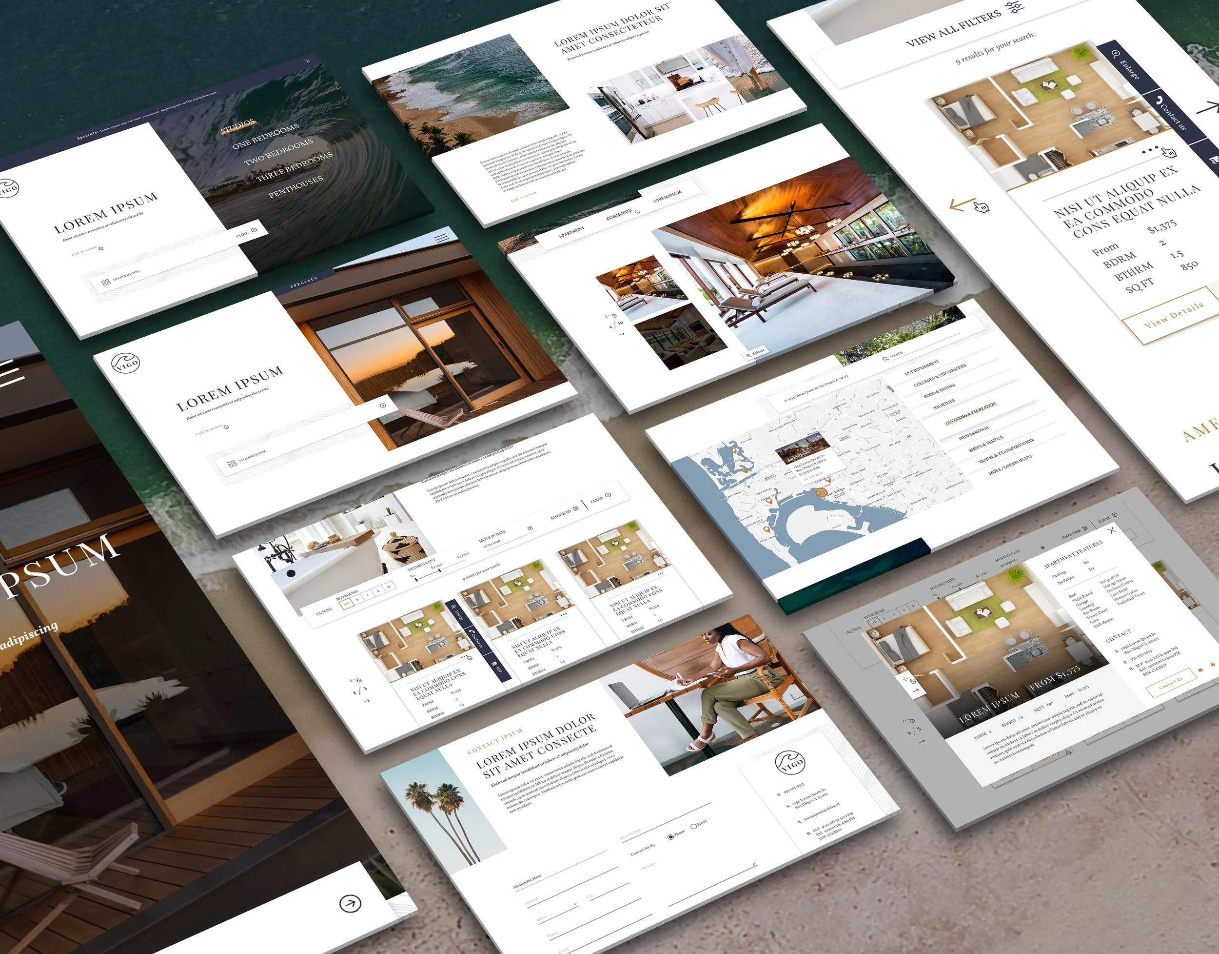
Vigo is a custom web theme I designed for Realpage, as part of their collection of themes marketed to properties across the country.
LeaseLabs is a GoDirect marketing agency with a focus in the apartment industry dating back to 2008. As a member of the RealPage family, LeaseLabs offers clients the concierge support and expertise of over 6000 team members around the world. LeaseLabs provides multiple tiers of agency design, one of which being the Website Plus tier. Plus Websites are a responsive web theme that balances speed of delivery with customization. Website Plus supports the ability to configure several design elements such as fonts, colors and layouts. Stakeholders approached the LeaseLabs web team with the goal of releasing 3 new themes quarterly for Plus tier clients to choose from.
The themes for Spring 2020 were Urban Contemporary, Coastal Luxury and Classic Chic, with Vigo being the Spring 2020 Coastal Luxury theme. While this project did not reach development due to the acquisition of a new CMS, Vigo will eventually be developed on a new platform.
Project Type: Website Plus Collection Theme
Project Scope: UX/UI Design, Responsive Web Design, Wireframing, Prototyping, Stakeholder Presentations
Tools Used: Sketch, InVision, JIRA, Adobe Suites
Goals & Objectives:
Build a library of high end web plus themes to market to property managers & ownership
Design one of three quarterly website themes
Appeal to a certain lifestyle - coastal luxury
Have the look & feel of a custom website
Be universal enough to successfully function as a theme
Design the site to work with CMS-changeable fonts and colors
Take an interactive virtual tour
Streamline conversion for prospective residents
Personas
Speaking with the product team’s stakeholders, we recognized that this being a theme means demographics could be varied depending on the property using it. However, because stakeholders wanted to target mid-rises, high-rises, and luxury offerings in coastal medium to large size cities we were able to create three personas based on market research. Age range was identified as late 20’s to early 40’s with some empty nesters. Most likely pet owners, and active due to the good weather of these coastal locations.

Example Branding
Because this is a theme, multiple colors used throughout the website needed to be changeable for the client in our CMS to either match their branding or suit their property better. For display purposes, placeholder branding was selected and then applied within the Spring 2020 Coastal Luxury Theme design.
Design Systems & Alternative Themes
When the “primary” branding was established, it was important to create a styleguide to hand off to development for the initial product build. Making this design eligible for all different color combinations was important, though, since changing colors could effect visibility for certain elements as well as make elements no longer ADA-compliant. I was tasked to provide multiple alternative web typeface pairings options and color palettes in the event that a property did not have a fully established brand.

Wireframes
Following LeaseLab’s single-page scrolling architecture, I began with low-fidelity wireframes, taking the opportunity to explore quick navigation options in the hero section, accommodating for several filtering options in the floor plans section, and creating a successful balance of imagery and content. LeaseLabs includes an interactive map in every neighborhood section, so I took the time to ensure it would highlight the interactive elements while not sacrificing a visual motif that had been established.
Designing for Mobile
LeaseLabs designs using a standard 12-column grid for desktop, and having that guide made the responsive designs much easier to achieve a cohesive experience across all resolutions. Utilizing “read more” CTA’s for lengthy amounts of text, mobile-friendly elements like accordions and changing the carousel card pagination to a more standard mobile experience made sure prospects weren’t sacrificing usability for design.
Designing full comps for mobile and tablet, as well as tools like Invision were used to clearly indicate all desired functionality and scaling.
High Fidelity Mockups
Designed in sketch and uploaded to Invision, these static comps show the details that our developers followed to bring my designs to life. These are also used to present the designs to project stakeholders, as well as gather any potential feedback from them. Ideally, these mocks would be handed off to a developer for a build, but due to acquisition of a new CMS, this project was paused.
You can view a prototype below!
Back to all projects.